Birdhouse
Twitter client for Android
Built together with Dion and Richard. We set out to create the 'Tweetbot alternative for Android', a Twitter client with a high degree of polish and an excellent user experience.
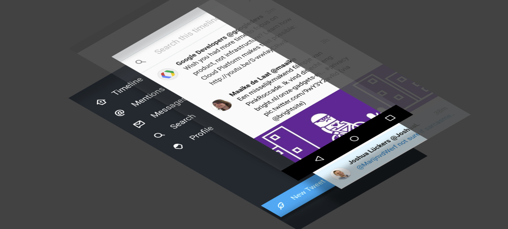
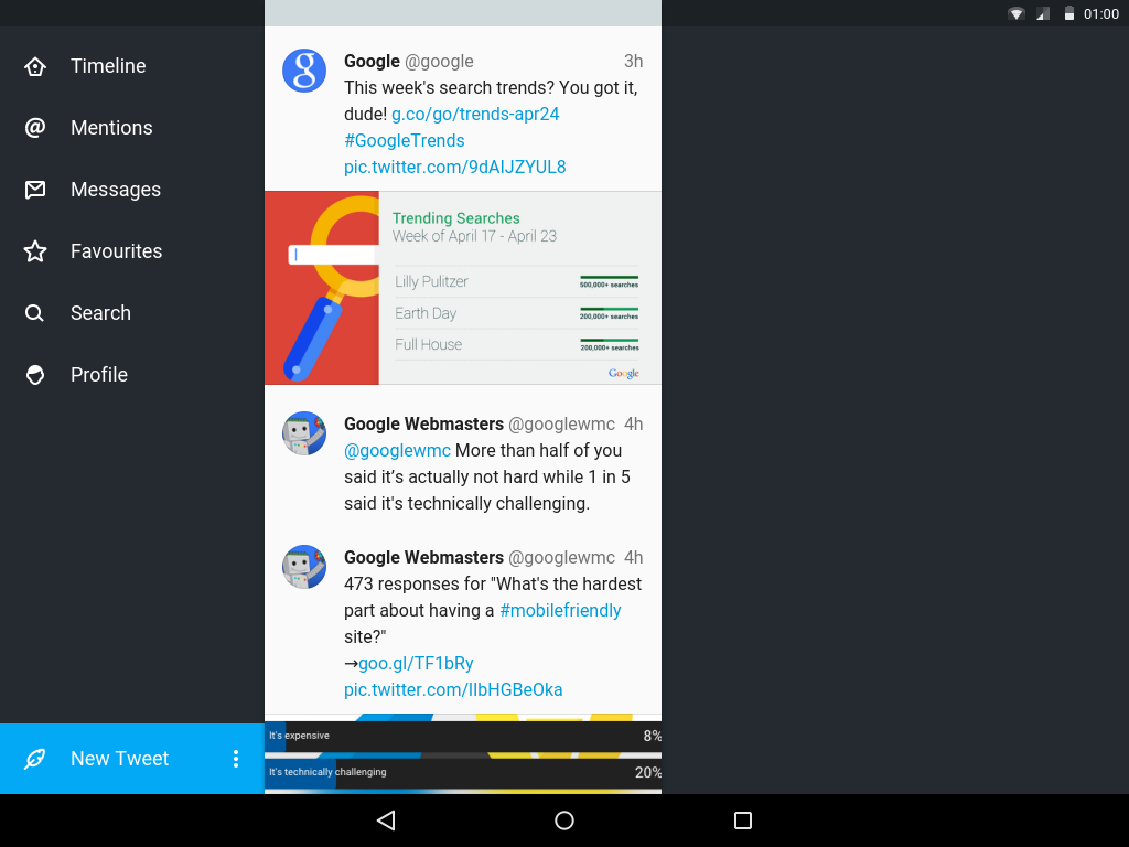
On a 16:9 7" tablet, there's already very little vertical space in widescreen mode, and even less so when you add in the top and bottom system bars. We reduced the number of bars, in order to maximise the used screen space.
Most tablet-oriented Twitter apps used a column-based approach, which I felt was difficult to use, and didn't translate well when the tablet was held in portrait mode. So I decided to base the navigation on the original Twitter for iPad app, which uses a stack of panels to make the navigation history easily understood. Using these more-narrow columns also allowed us to add in phone compatability, which uses the exact same layouts, but instead fills a screen. Although this means no navigation is visible on a narrow phone screen, we felt it was appropriate for an app aimed at power users.
In order to add a splash of personality and colour, I decided to theme the profile pages. Inspired by iTunes 11 and the built-in Palette library, I made the profile headers use the user-provided banners to provide an extra personal touch. This also helped lessen the visual complexity of the header, as it previously contained a more separate banner and background.
In order to finetune the algorithm used to pick the neccesary colours, I ported the Palette library over to PHP as well as JavaScript, so I could more effectively iterate. A browser-based solution has the advantage of being both faster to evaluate changes, as well as offering more real estate, so you can easily see how your changes work on a variety of input images.

