

Shopping app redesigned, taking into account the 'new' (2012) Android design guidelines.
In 2012, I got the assignment to redesign a popular Android app. For this project, I decided to work on 'Appie', the app by one of the largest Dutch supermarket chains. At this point, the 'Holo' design guidelines were just released, and the app was still using the pre-Android 4.0 design style. In order to provide a modern design, I followed the new guidelines, while still adding some personality in the form of textures.
The old app relied on the menu button for switching between modes, this was replaced with an actionbar with a spinner, adding visibility to the previously mystery meat menu interaction. And the dashboard-based design was replaced with a design that put the shopping list up front and center.
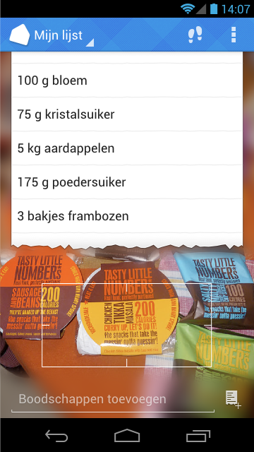
When you open the app, the camera immediately is enabled. This way you can immediately add items to the shopping list shown above.
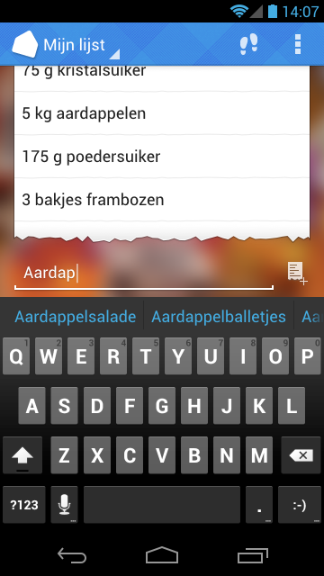
While typing, the app gives suggestions on what you might be trying to add. Instead of adding another list to the UI, the auto complete bar is used, providing users with a familiar and easy-to-reach option for picking groceries.
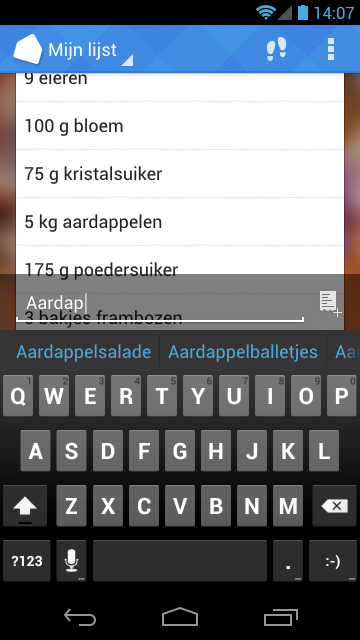
When you start scrolling, you still want to be able to see what you're doing. That's why the input gets a background when you've moving up your list.
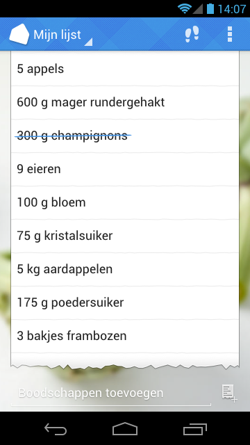
Not everyone will want to have their shopping app using the camera all the time, that's why the camera background can be disabled, and replaced with a weekly-changing background to keep things fresh.
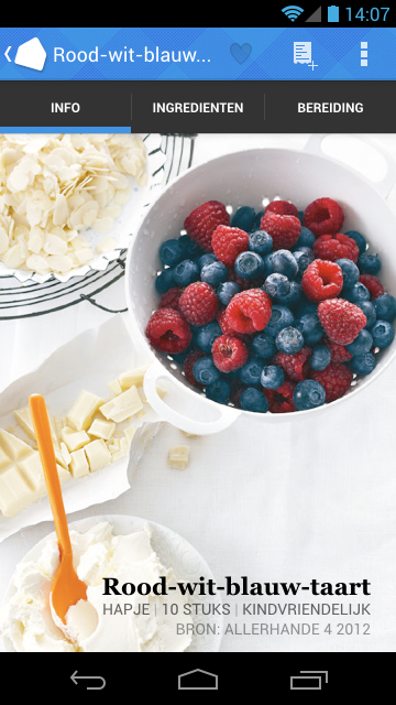
When you scan a recipe card in-store on in the magazine, the app immediately opens up the recipe page, where you can easily add items to your shopping list.
If you add a recipe, you can choose the portion count you want to cook. You can do the math... but you don't have to.
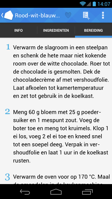
During preparation the text is shown in a comfortable large size, so you can easily read it. The app also makes sure the screen stays on while cooking, so you don't need to worry about pressing buttons with greasy fingers.